

The purpose of this project was to creating a work that informed an audience. I did this by exploring the work of Jan Tschichold and understanding how to incorporate his ideas into my work. My designs reflect the values, attitude and craft suitable of a "master typographer." I used typographic hierarchy and a modular grid of 1" x 1" to organized my design. Access my dropmark here for my process.
The finished project had to be a 9" x 6" x 1" book cover with 2 inch flaps. There was supplied text that had to be used only once per design. The three designs that had to be made were to be distinctly different ideas. They included: a name dominant design using Jan Tschichold's name and use 2 PMS colors on white stock, a title dominant design using one or both of the words master typographer, a portrait of Jan Tschichold, using 2 PMS colors on white stock, and lastly, a sub-title dominant design using the words life or work or legacy or variation of the three plus a visual metaphor image to relates to Jan Tschichold, usin 2 PMS colors or process colors on white stock. There were also select typefaces were were allowed to use. We were allowed to use a combination of 2 of the following fonts: adobe garamond pro, bauer bodoni, futura, DIN, univers, serifa, memphis/rockwell. The required text mentioned above was: Jan Tschichold, Master Typographer: His Life, Work and Legacy, Cees W. de Jong, Alston W. Purvis, Martijn F. Le Coultre, Richard B. Doubleday, Hans Reichardt, Cees W. de Jong-editor, Thames & Hudson, London, 2008.
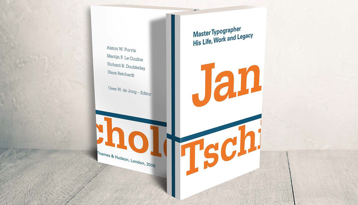
Design Proposal One: This design is supposed to emphasize Jan Tschichold's name. I appreciated to use of oversize text to push the idea of this book. This design is eye catching and would pull an audience in to read or buy this book.
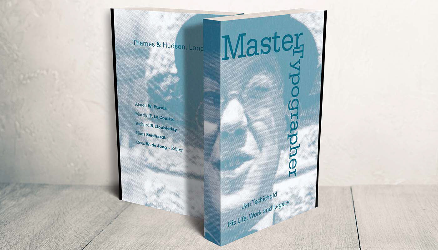
Design Proposal Two: This design turned out to be my favorite. The colors work well together and the format of the image is interesting. The spine is "eye" catching and meshes well with the rest of the book.
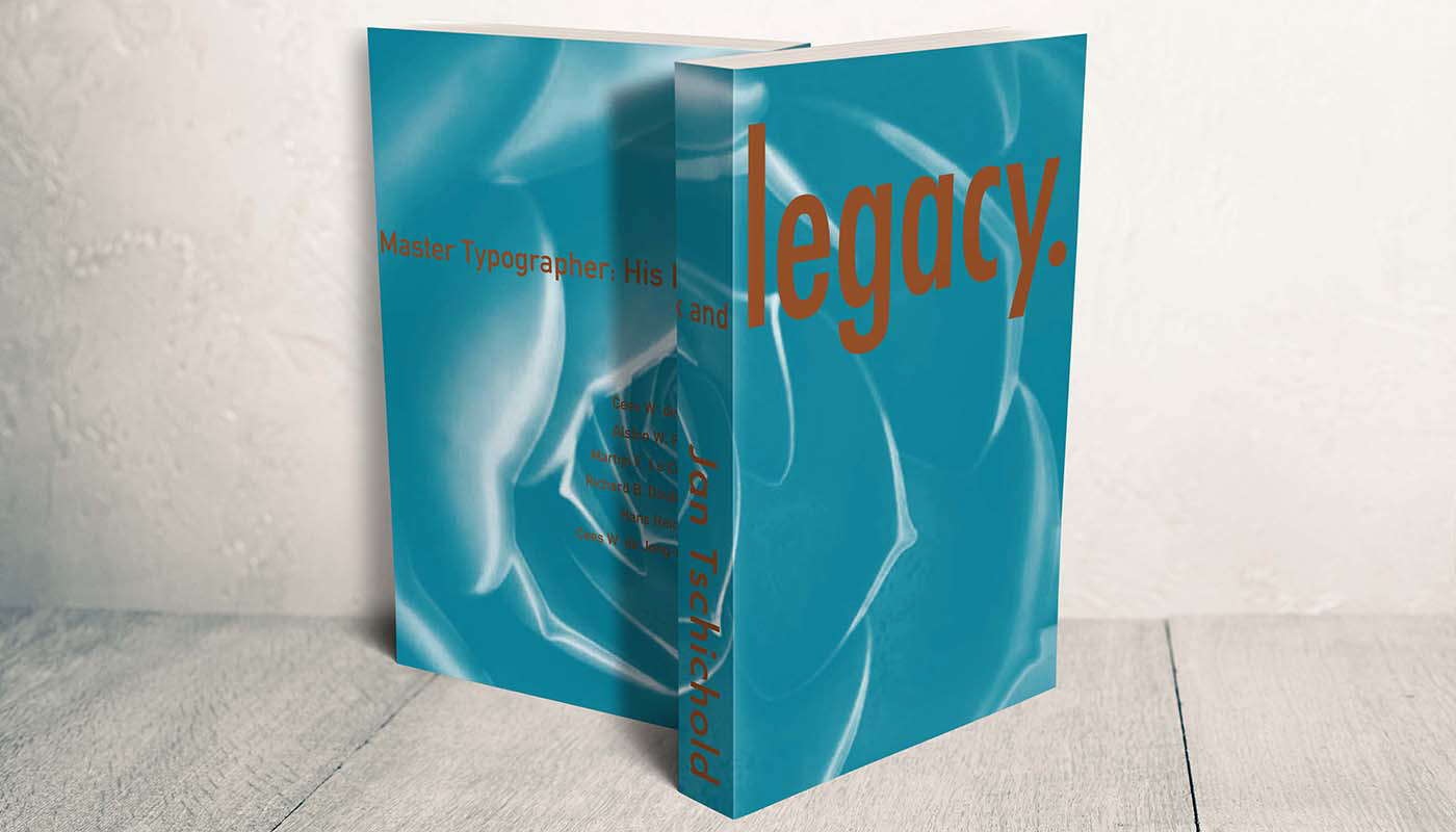
Design Proposal Three: This design, similar to the first proposal, uses oversized text to emphasize its purpose. It feel like this book contains the Legacy of Jan Tschichold. The text on the back flows cleanly through to the next pages and makes to audience move the book around to have the full effect.
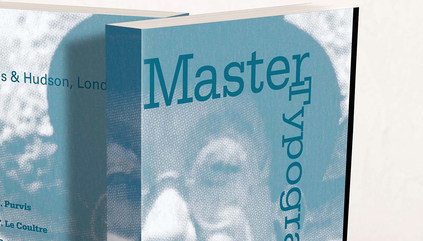
Design Proposal Two Close-Up: This work deserved a up close shot of this design. The almost interlocked serifs of the r and T in the title add to the design and I appreciated the way it turned out.
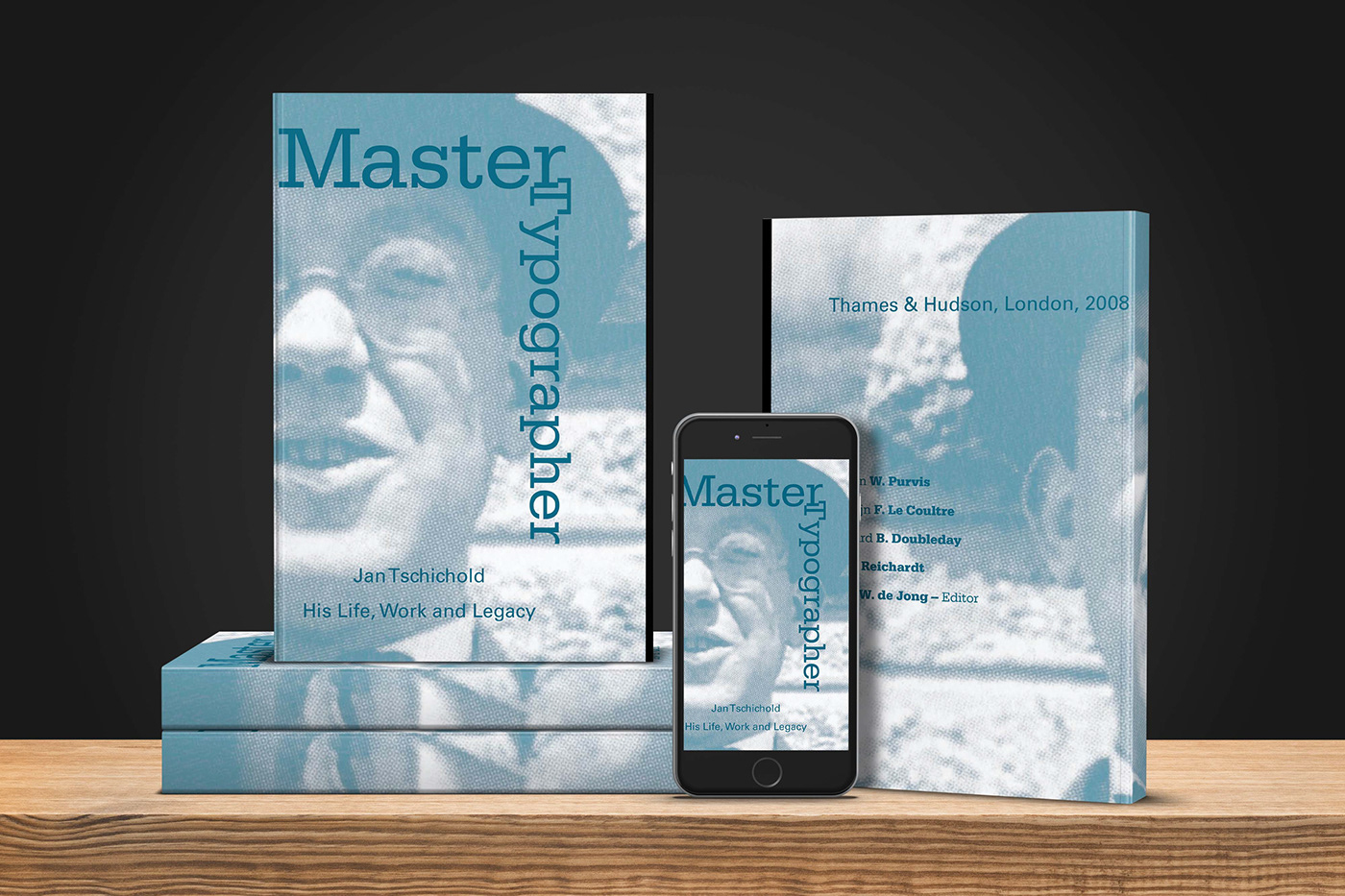
Here is my jacket applied to a Photoshop Mockup. I chose this specific mockup because I tend to read books on my phone, so I thought this mockup works on a personal level. The overall theme feels academic to me. You can tell the book you are about to read is about a true Master Typographer.

This mockup shows the entirety of the book. I really like how this design applies to a mockup. I designed the black line to be where it is to establish a rule that could be continued throughout the book. The title works well at establishing the topic and the colors mesh together in an appealing way.

Here is my design on a hardcover book mockup. This design effectively uses the flaps and adds a rule using the black line. The best word to describe this design is enigmatic, meaning it feels mysterious.. Almost like you have to open the book to understand the mystery of Type.


